Well, one major reason for that could be your frontend performance. If your website is slow, clunky, or annoying to navigate, users won’t stick around. It’s that simple.
A bounce happens when someone visits your site, looks at one page, and leaves. That’s it. No clicks, no scrolling to other stories, no interaction. It’s like someone walking into a store, glancing around for two seconds, and walking right back out. Not great, right?
Bounce rate is the measure of how many people visit a website and then leave without any interaction.
For media sites, this number can be alarmingly high—often more than 60%. Now, you might assume it’s all about content. Sure, content plays a huge part. But in my experience, performance issues on the frontend are often the hidden reason people leave too quickly.
The faster and smoother your site feels, the more likely it is that people will stay long enough to read something—maybe even click on more.
So if you're trying to improve bounce rate and you've already worked on your content, this article is going to walk you through what you can fix on the frontend side of things.
In this article, I’ll walk you through how optimizing your frontend can help lower bounce rates and keep visitors engaged longer. I’ll break things down into simple parts, so even if you're not a developer, it will still make sense.
Let’s dive in.
Why Frontend Performance Matters So Much
This includes everything from text and images to buttons, animations, and video players. It also includes how fast these elements load and how smooth the site feels while using it.
Now here’s the thing—first impressions happen in milliseconds.
If your site lags or elements load out of order, people won’t wait. They’ll hit the back button. After something is gone, it likely will not return.
Studies show, even a one-second delay in page load time can reduce conversions by 7%. For media sites that rely on page views, that means fewer ad impressions, less engagement, and lower revenue.
Common Frontend Mistakes That Drive People Away
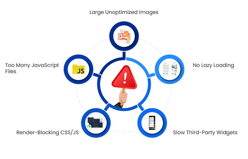
These are the most frequent frontend issues that cause people to leave before they even read your headline:
1. Large Unoptimized Images
Media sites love photos—and rightly so. But uploading huge image files straight from a DSLR or stock photo site is a killer. I’ve seen sites with homepage images that are 5MB each. That’s like making someone download a full song just to see a photo.
Fix:- Use tools such as TinyPNG or ImageOptim to make image files smaller.
- Serve them in modern formats like WebP, which reduces file size without killing quality.
2. Too Many JavaScript Files
JavaScript powers interactive features like sliders, menus, ad displays, and analytics. But having too many scripts, or loading them all at once, slows down everything.
Fix:- Combine and defer scripts where possible.
- Only load what’s needed for the page the user is viewing.

3. Render-Blocking CSS/JS
This happens when your browser has to load certain scripts or styles before it can display anything. Users see a blank screen, and they leave.
Fix:- Inline critical CSS.
- Defer non-essential styles and scripts.
4. Slow Third-Party Widgets
Think of live chat plugins, social share buttons, or ads. These come from external servers, and you can’t control how fast those load. If they’re slow, your whole page feels broken.
Fix:- Load third-party widgets asynchronously.
- Load them after the main content has finished loading.
5. No Lazy Loading
If your site tries to load every image and video on a long article all at once, you’re asking too much from the browser.
Fix:- Implement lazy loading.
- Only load media when it's about to enter the user's view.
Practical Fixes That Make a Real Difference
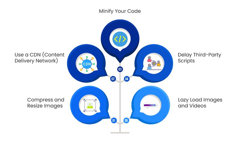
Improving frontend performance isn’t just about throwing buzzwords around. It’s about smart, simple changes that keep your readers happy. Here are some practical fixes I’ve used that work well:
1. Compress and Resize Images
Uploading images that are too big for the container they’re shown in is one of the most common performance mistakes. If an image is going to be displayed at 800px width, don’t upload a 2400px version.
Use Tools Like:- TinyPNG
- Squoosh
- ImageMagick (for bulk processing)
2. Use a CDN (Content Delivery Network)
A CDN stores copies of your site’s assets on servers around the world. So if someone in Germany visits your US-based site, they don’t have to wait for assets to load from across the ocean.
Popular CDN services:- Cloudflare
- Bunny.net
- Amazon CloudFront

3. Minify Your Code
Minification removes unnecessary characters from code. You won’t notice it visually, but it makes files smaller and faster to load.
Use minification tools like:- UglifyJS (for JavaScript)
- cssnano (for CSS)
- HTMLMinifier (for HTML)
4. Delay Third-Party Scripts
Don’t let ad scripts, analytics trackers, or social widgets block the page from loading. Serve them after the primary content loads. This makes the site feel faster, even if the extra tools take a second to appear.
5. Lazy Load Images and Videos
This one’s a game-changer. Lazy loading means images and videos only load when they’re about to be seen. It reduces initial page load time by a lot.
<img src="image.jpg" loading="lazy" alt="example">
That’s all it takes.
The Role of Good Design
Performance is one thing, but visual design and usability play a big role in bounce rates too.
1. Avoid Overloading the Reader
Picture this: You click on a media site’s homepage and right away you’re hit with a pop-up asking for your email. Before you can close it, a video starts playing automatically. As you scroll, ads fill every corner, more content previews appear, and then a second pop-up appears offering a discount or subscription.
It’s overwhelming. And it happens far too often.
When users land on your site, they’re not looking to fight through a maze of distractions. People are just looking for helpful content. If your site makes that hard, they’ll leave before you get the chance to engage them.
What Can You Do?Keep it clean. Focus on clarity. Remove what isn’t necessary and give the content room to breathe. Here are the ways you can achieve it:
- Stick to one pop-up—and delay it so it doesn’t interrupt immediately.
- Avoid auto-playing videos, especially if they include sound.
- Don’t cram everything above the fold. Let the page unfold naturally as the reader scrolls.
- Use white space intentionally. It makes your content easier to scan and more inviting to read.
When in doubt, look at your homepage like a visitor would. Is it welcoming, or is it trying to do too much all at once?
2. Guide Readers with Clear Navigation
Let’s say someone reads an article on your site and really enjoys it. Now what?
If they’re interested in more, your job is to make that next step obvious. The truth is, readers won’t dig through a site to find what they want. If your navigation is unclear or cluttered, most won’t bother.
How to Make Navigation Work Better:- Use simple, well-labeled menus. Whether it’s News, Tech, Entertainment, or Sports—make the sections easy to find.
- Include a search bar. It doesn’t need to be fancy, just accessible and functional.
- Suggest similar articles or reading material either below the main text or even in the middle of a longer paragraph.
- On category pages, group content logically and make sure filters or sorting tools are easy to use.
- Use breadcrumbs so readers know where they are and how to get back.
Think of navigation like signposts on a trail. The clearer they are, the less likely someone is to turn around and leave.
3. Make Reading Comfortable with Good Typography
Good typography isn’t about being stylish—it’s about being readable. If your content is hard to look at, no one’s going to stick around long enough to read it.
I’ve come across sites that use tiny font sizes or low-contrast colors, and it turns reading into a chore. That’s when bounce rates quietly go up.
Make These Adjustments for Better Readability:- Set the base font size to at least 16 pixels. For mobile, going slightly larger can help.
- Maintain a comfortable line height, around 1.5 times the font size. It improves flow and makes longer reads less tiring.
- Choose strong contrast for your text. Avoid light gray on white backgrounds—go with dark gray or black for body text.
- Stick to web-friendly fonts like Roboto, Lato, Georgia, or Arial. Avoid decorative fonts for paragraphs—they’re better suited for headers or logos.
- Break text into short paragraphs. One idea per paragraph usually works best, especially for users reading on smaller screens.
Another simple tip: If your paragraph takes up half a mobile screen or more, it’s probably too long. Break it into two. You’re not just improving readability—you’re helping users stay engaged.
Curious which front-end technologies are shaping modern websites in 2024?
Discover the most reliable and efficient tools developers are using this year to build fast, engaging user interfaces.
Read the Full BlogDon’t Forget About Mobile
Most people read on their phones now. If your site looks great on desktop but breaks on mobile, you’ll lose a lot of users.
Here’s what to check:
- Responsive layout that adjusts to screen size
- Buttons that are easy to tap
- Mobile load time under 3 seconds
Use Google’s PageSpeed Insights to test how your site performs on mobile.
A Quick Note on Core Web Vitals
Core Web Vitals are Google’s way of scoring your site’s experience. They focus on three key areas:
- Largest Contentful Paint (LCP): How long it takes for the main content to appear.
- First Input Delay (FID): How soon can a user interact with something?
- Cumulative Layout Shift (CLS): Does the layout jump around as it loads?
Improving these metrics doesn’t just reduce bounce rate. It also helps with your search engine rankings.
Keep an Eye on Your Progress
Frontend optimization isn’t a one-and-done task. You’ll want to test, tweak, and measure constantly.
Tools to monitor performance:
- Google PageSpeed Insights
- GTmetrix
- WebPageTest.org
- Lighthouse (built into Chrome)
Check bounce rates for each page in Google Analytics. That way, you’ll know which pages need the most work.
Frustrated with slow load times or high bounce rates?
Let Zenesys help you optimize your frontend for speed, responsiveness, and better user engagement with our expert development services.
Optimize Your FrontendContent Still Matters (A Lot)
Speed won’t save bad content. Your headlines, writing, and visuals still need to draw people in and keep them interested. But frontend issues shouldn’t be the reason they leave before even reading. With a free AI photo editor, you can polish images effortlessly and boost engagement.
Here’s what works:
- Strong intros
- Breaking up text with headings and visuals
- Related content links to keep readers clicking
- Clear CTAs (like “Read More” or “Watch Next”)
A Final Thought
Start with one thing—maybe image optimization or deferring third-party scripts. Then test. See if the bounce rate drops.
Fix the next issue. Rinse and repeat.
If your site is easy to use and loads quickly, people will stick around. And that’s really what it’s all about.


.webp?lang=en-US&ext=.webp)

.webp?lang=en-US&ext=.webp)

